RiseUp
website
Web design, Content strategy & architecture, UI
Through 2023, We recreated RiseUp's main website. Since it focused on brand awareness rather than conversion, we had more creative freedom to really emphasize our values. In line with our financial wellbeing strategy, our unique selling point was the app's fresh approach to finance: human, friendly, easy to understand. No dashboards, no complications. The design goal was to amplify the human and friendly, unlike most fintech products.
The process
Breaking down the messaging
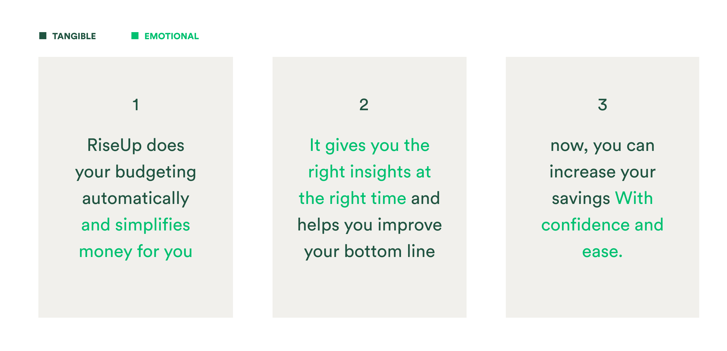
As a start, we mapped our value propositions, understanding what should be the main ones showcased in our website.
We opted for valuable + easy to understand in first/second visit.

Structure and wireframing
I partnered with the copywriter and Head of Marketing to align with stakeholders on the site's structure and messaging priorities. Through an iterative wireframing process, I designed layouts that best communicated our key messages.


Skeches


Home Page

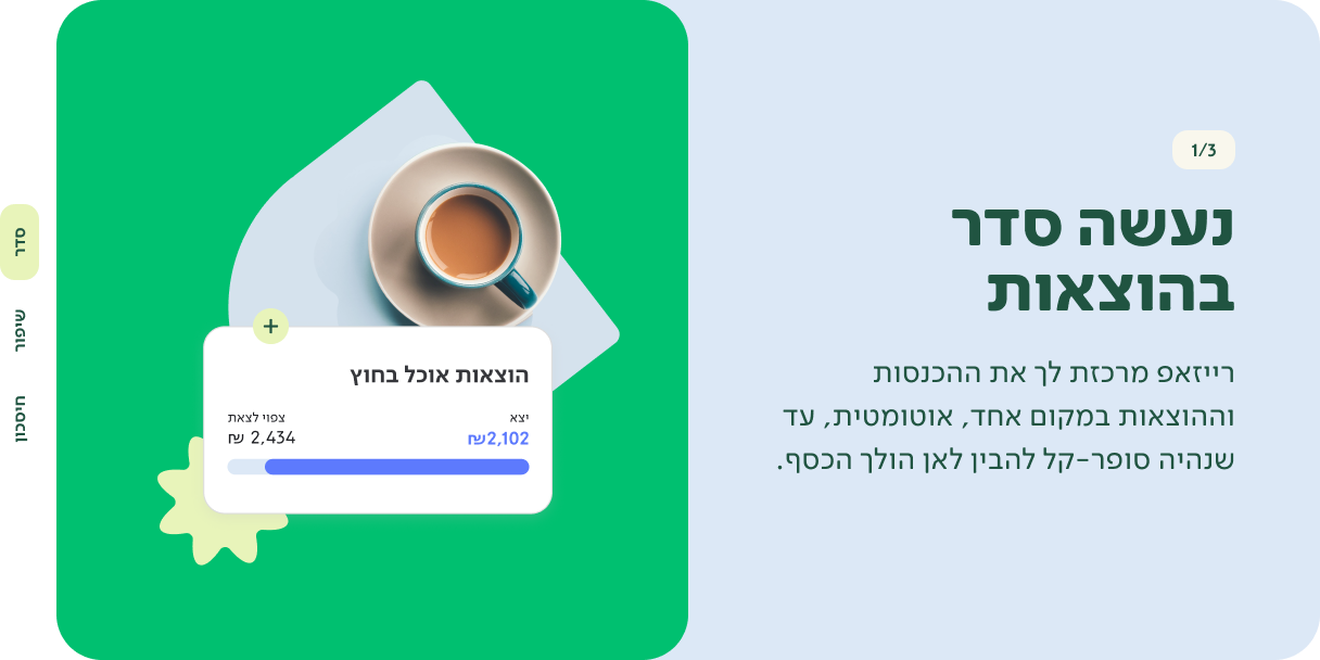
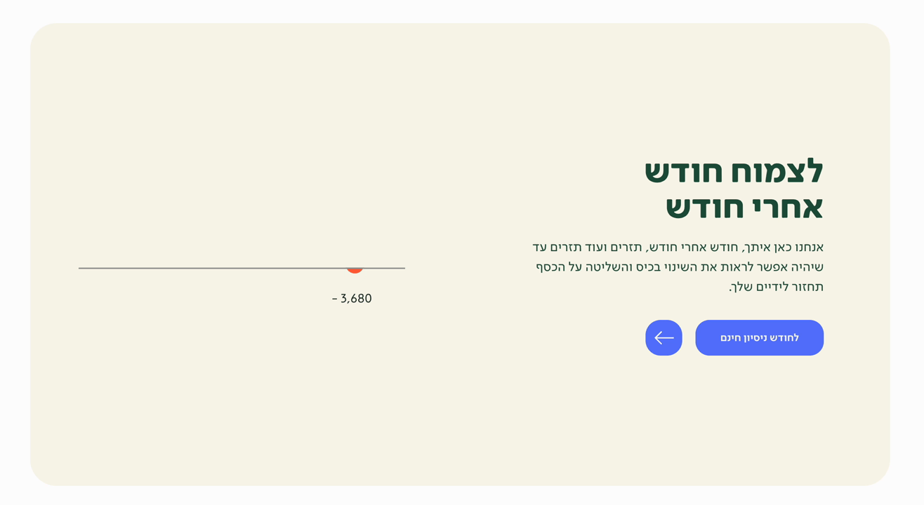
Enjoy financial wellbeing

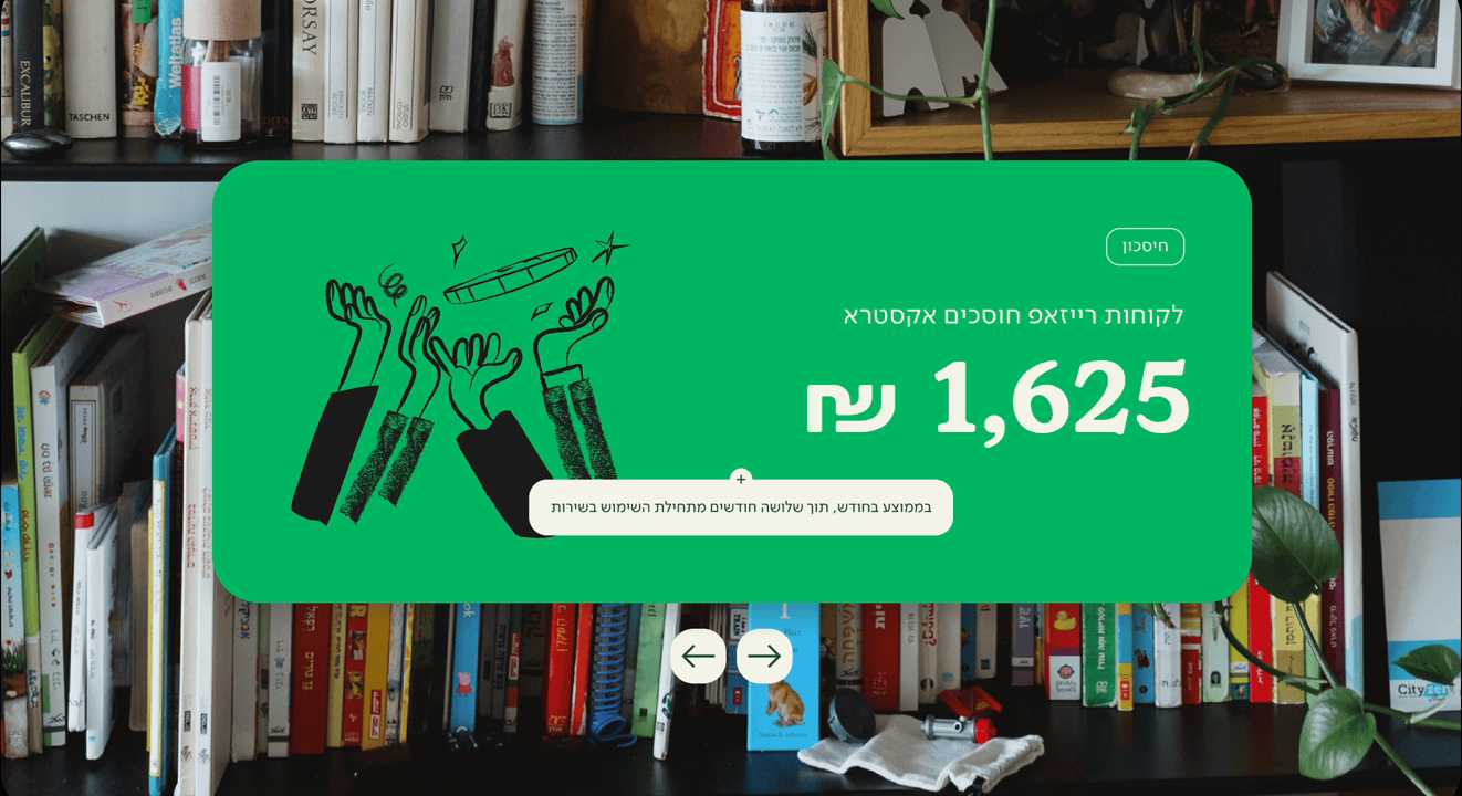
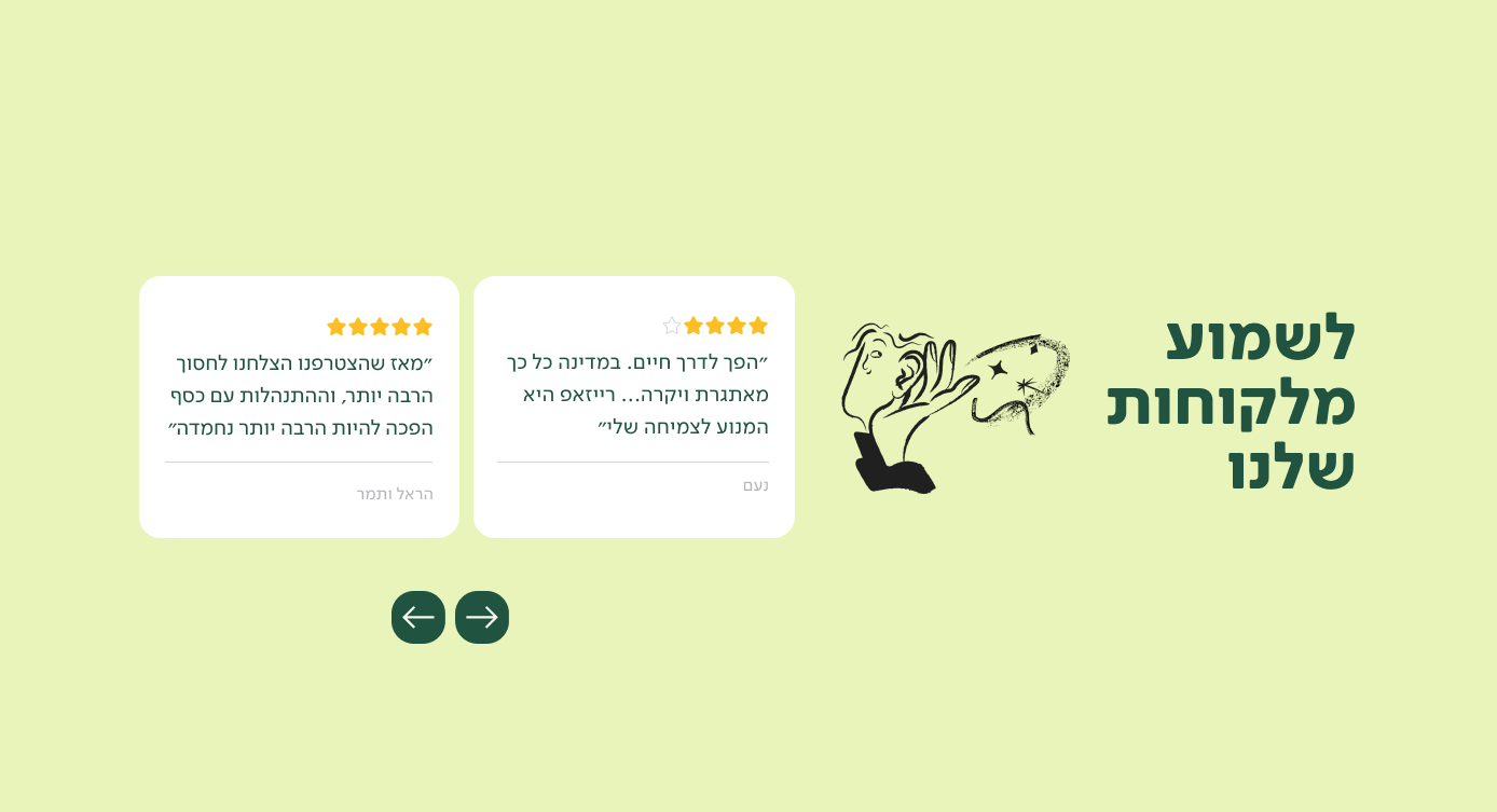
Our community shortens the road to transformation
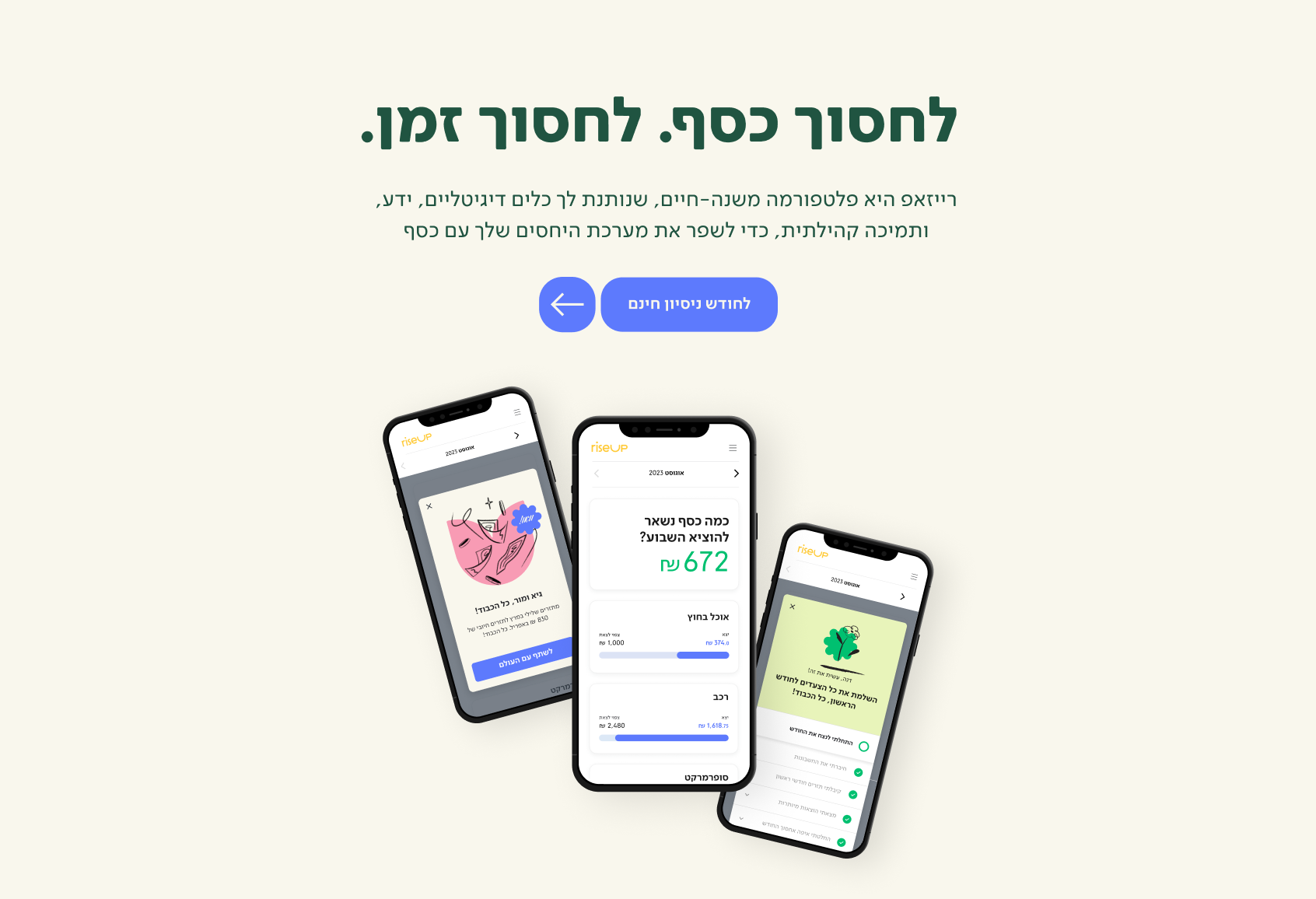
connect your bank and credit accounts, and start organizing your finances. RiseUp does the math for you and gets you on top of your finances. Now, you can stress less and save more.
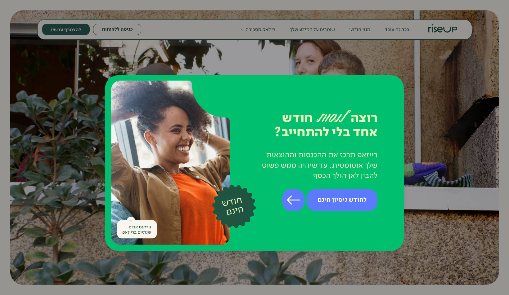
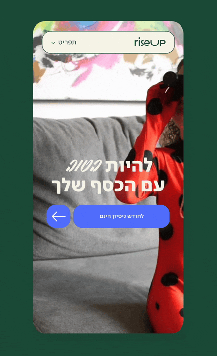
Try one month free, no commitment.


We’re also looking for this page… Something went wrong, sorry. Back to homepage
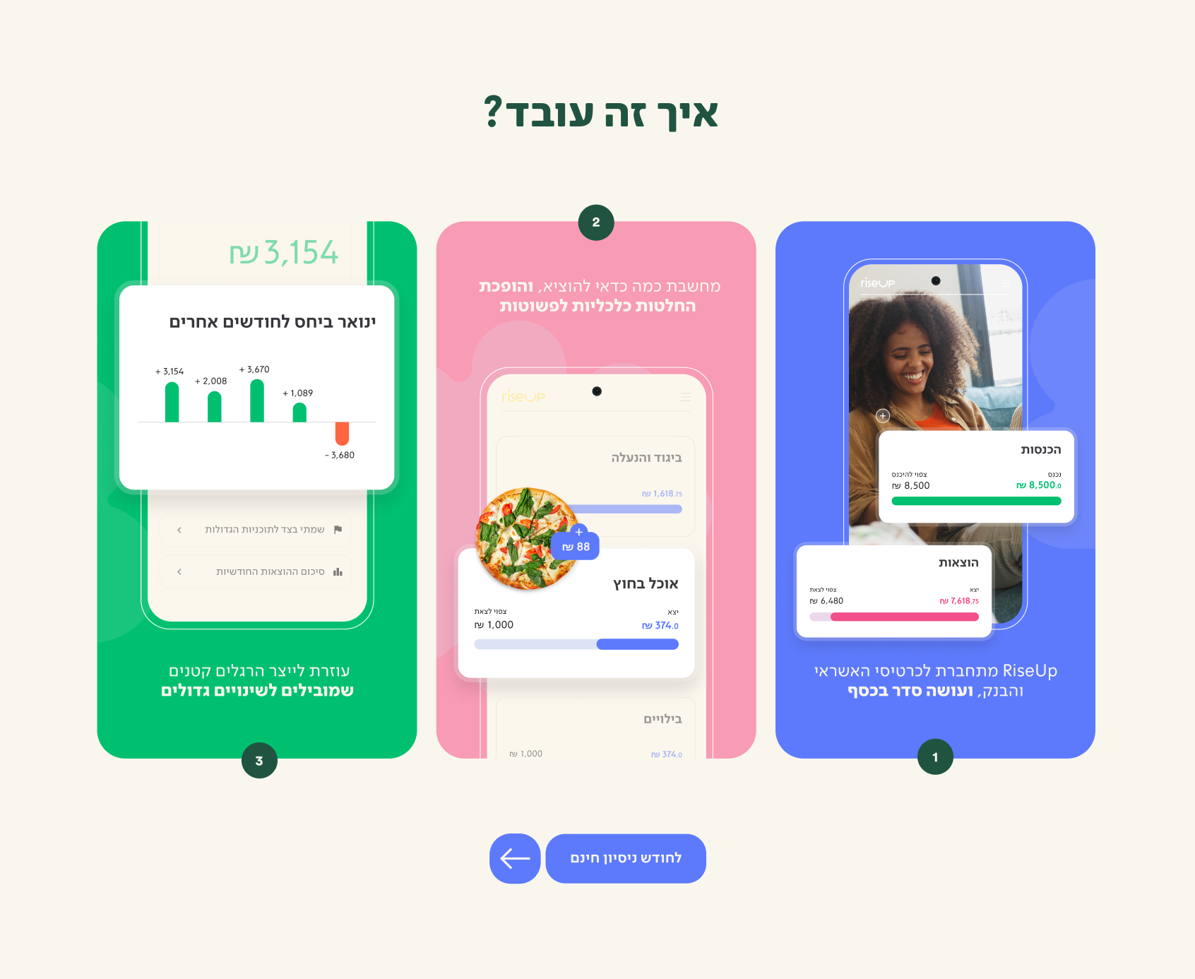
How it Works page
The challenge of presenting and simplifying key features in the product was one of my favorites. The work involved many sketches, user testing and iterations, as well as art direction of all animations.

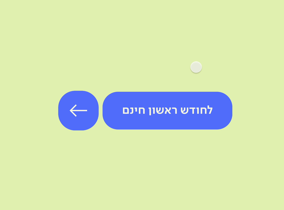
→
Connect all your accounts easily in securely
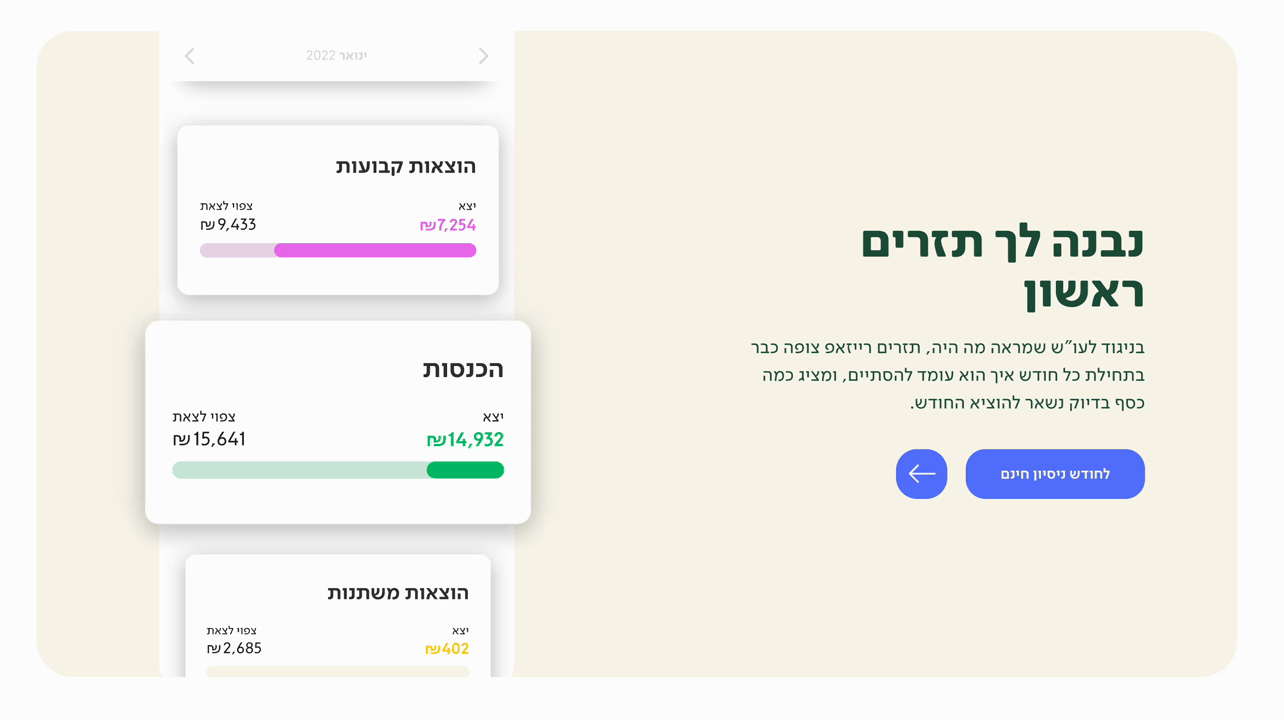
→
Get yout first cashflow and see a full picture of your income and spending.
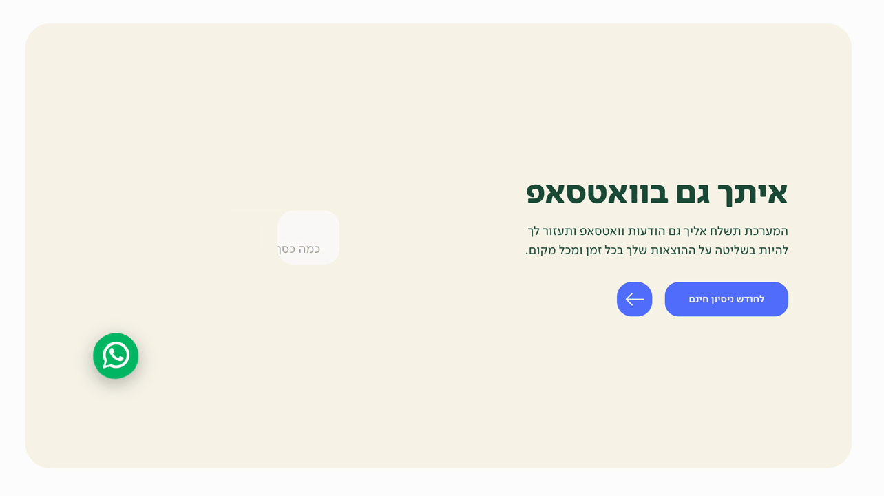
→
Get WhatsApp messages to stay updated on what’s important.
→
See results month by month.
